Where should I look on Myfxbook to tell if an EA is risky?
If the curve keeps going up, isn’t it safe?

An upward curve doesn’t automatically mean “safe.” In fact, a curve that looks too smooth can be a red flag.
What matters isn’t how the profits grow—it’s how the system breaks when price moves against it.
On Myfxbook, check the gap between Balance and Equity, spikes on the Margin tab, and History (whether it uses SL, closes many trades at once, or increases lot size).
These clues often reveal blow-up risk strategies like grid (averaging down) or martingale.

Introduction: Myfxbook Isn’t a Tool for Staring at a “Perfect Upward Curve”
Myfxbook is a useful service that lets you review an EA’s (automated trading system’s) performance from a third-party perspective. But it’s risky to assume that “a beautiful upward curve = safety.”
What you really need to judge is not how profits grow, but how losses show up when things go wrong (how drawdowns unfold), and whether the strategy can still hold up when market conditions or execution quality change.
In this guide, we’ll organize key Myfxbook tabs and statistics into a practical workflow—a checklist to spot risk and verify repeatability without being fooled by appearances.
Key Takeaways (What to Know First)
- Be cautious of curves that look too perfect: it may indicate a strategy that avoids cutting losses. Grid (averaging down) and martingale systems often carry blow-up risk.
- Be cautious of extremely high win rate or Profit Factor: many systems look great early on, then suffer occasional large losses (a classic small wins, big loss pattern).
- Don’t judge from the “headline numbers” only: confirm the strategy’s behavior via History, Trade Map, Average Win/Loss, Worst, Duration, and more.
- Execution environment matters: Is it a Real account? Is the broker reliable? Be extra careful with unknown brokers or Demo accounts.
What You’ll Learn (How to Read Myfxbook Step by Step)
- How to spot “good-looking but misleading” results: where to check for holding floating losses, deposit “life support,” and grid/martingale clues
- How to use each metric properly: Gain/Abs. Gain, Profit Factor, expectancy, average win/loss, max drawdown—what each is for
- Cross-checking across tabs: how to connect Growth, Drawdown, Margin, Duration, History, and Trade Map to judge how a strategy breaks
- Estimating the strategy type: how to identify signs of grid/martingale vs breakout styles inside Myfxbook
Minimum Checklist: If It Fails Here, Don’t Go Deeper
- Account type: Real or Demo (Demo is reference only—don’t overtrust it)
- Broker: Is it a major, reputable broker? (Great results at unknown brokers require extra caution)
- Floating-loss signs: a large Balance vs Equity gap, and spikes on the Margin tab
- Grid/martingale signs: lot size increases and many trades closing at the same time in History
- Numbers that look “too good”: the higher the win rate/PF, the more you should question hidden risk
How to Read Stats / Growth: Filter Out Risky EAs in the First Minute
Start by Confirming the Basics (Trust Check)
Myfxbook’s first step is not the curve—it’s whether the data is trustworthy.
- Track record: Is tracking still active? (Green check = OK)
- Trading privileges: Is account ownership verified? (Green check = OK)
- Real / Demo: Account type (Demo results should be discounted)
Real vs Demo: The “Repeatability” Assumption Changes
The header shows Real or Demo.
Don’t overtrust Demo performance. Demo trading may not fully reflect real-world negatives such as slippage, requotes/rejections, and liquidity drops.
This is especially true for scalping-style EAs: they can look great on Demo, then break down on Real.
Related: Scalping EAs: Why They Often Fail on Live Accounts (Costs, Slippage, Execution)
What to Check in Summary Stats (Avoid Common Misreads)
- Gain vs Abs. Gain: deposits/withdrawals can make Gain look “reset.” Always check Abs. Gain too.
- Track record length: short periods and small sample sizes are easily driven by luck.
- A “too smooth” Growth curve: be cautious—grid/martingale systems may hide floating losses from the curve.
- Drawdown: if DD is large but the curve looks perfect, suspect display blind spots.
See also: EA Drawdown (DD) Explained: Focus on Equity DD, and Set a Risk Limit
Case: Grid (Averaging Down) EAs Often Create “Beautiful” Curves
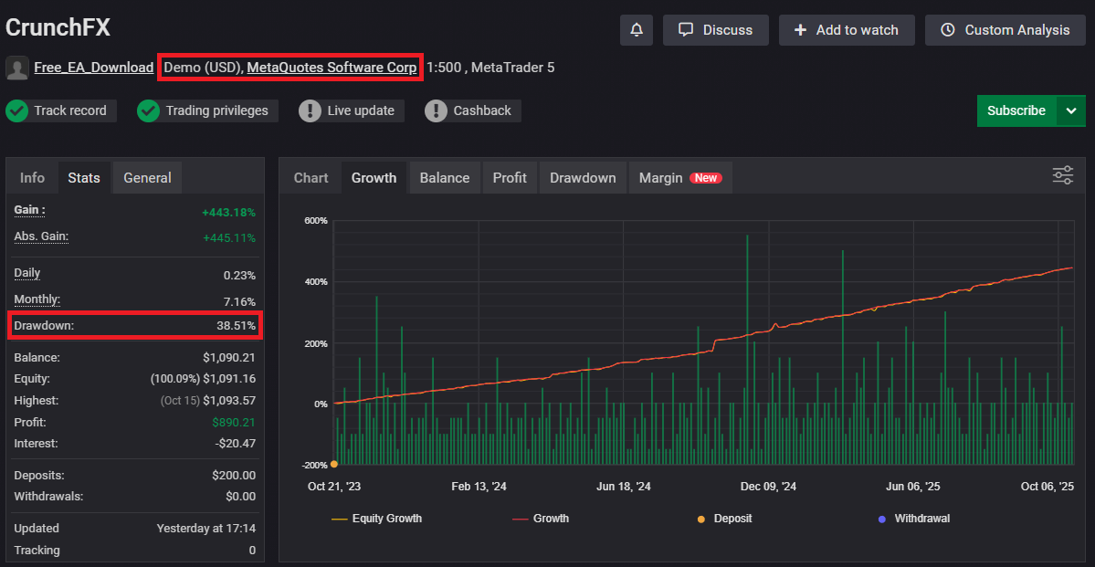
Grid strategies often appear to have little drawdown in the short term. If the system doesn’t cut losses (or cuts them very late), it can look “calm” until a breaking point arrives.
But in a strong trend where price doesn’t come back, the strategy can take a single large hit.
In this example, the curve looks smooth, yet the summary shows 38.51% drawdown. Don’t judge by looks alone.
Below is an example where an EA looked strong for a while, then collapsed late in the run.
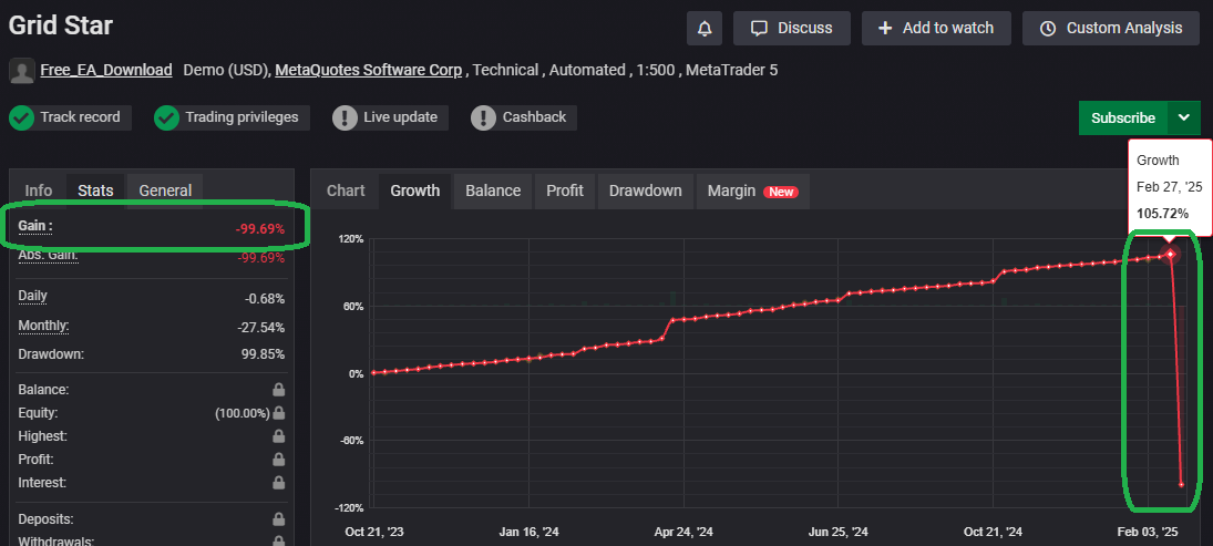
Martingale systems can also look “smooth” early because they increase lot size after losses to recover quickly. But a losing streak can wipe the account fast.
Related:
Why Grid Forex EAs Blow Up: Hidden Drawdowns + Red Flags (Self-Made EA Test)
Martingale EAs: Why They Blow Up (Backtest Proof + Checklist)
Case: Breakout EAs Can Show “Normal” Drawdowns
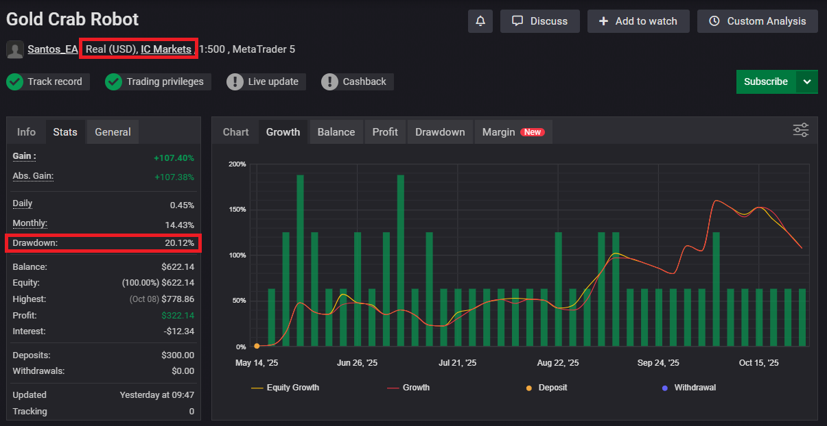
A curve with visible drawdowns may look less attractive. But drawdown isn’t automatically “bad”—it can also mean the EA is actually cutting losses.
A curve that isn’t overly smooth can be a sign that the system is not hiding risk by holding large floating losses.
Related: Do Breakout EAs Work? Pros, Cons, and Practical Tips
Check the Gap Between Balance and Equity
The Growth curve (Balance) is balance-based and doesn’t show floating losses. Equity Growth reflects floating P/L.
If Balance (red) is rising while Equity (yellow) drops sharply, it’s a sign that floating losses expanded.
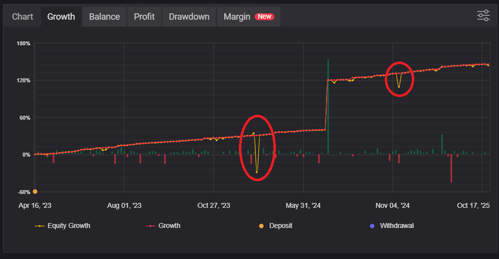
This is common in grid systems that hold drawdowns and later close near breakeven or small profit. A pretty curve can hide high risk.
Important: Equity Growth Can Miss Some Drawdowns
Myfxbook’s Equity Growth may not capture every drawdown, depending on sampling/timing. It isn’t always drawn as a perfect continuous record.
So the chart can look fine even if a drawdown happened in reality. Don’t rely on the curve alone.
What to do: cross-check Drawdown (%) and the Margin tab (spikes).
Always Check the Broker Name (Trust Check)
Check the broker/server name in the header. A Real account at a reputable broker is a meaningful trust signal.
If results look “too good” at an unknown or unregulated broker, be careful. Some reports may be created to sell an EA.
Decision Summary (Stats / Growth)
- Trust first: Track record, Trading privileges, Real account
- Structure next: a big Balance vs Equity gap suggests hidden floating-loss risk
- Verify: confirm with Drawdown (%) and Margin spikes
How to Read the Margin Tab: Spot “Floating-Loss Holding” via Margin Spikes
The Margin tab helps you spot high-risk strategies such as grid (averaging down) or martingale—systems that can blow up an account in one bad move.
Note: Myfxbook’s “Margin” is not the same as margin requirement. On Myfxbook, it’s a percentage (%) ratio based on equity versus position value.
Definition: Margin is the percentage (%) value based on the amount of equity versus position value.
This shows how “heavy” the position is relative to equity, and how floating losses affect free margin over time.
- Higher Margin %: more cushion (lighter exposure or equity boosted by profits)
- Lower Margin %: less cushion (heavier exposure or equity reduced by floating losses)
Why the Margin Tab Matters
Growth (Balance) and even Equity Growth can look clean, while free margin temporarily collapses during adverse moves. Margin spikes often capture that moment.
Key risk: strategies that add positions while in drawdown (grid/martingale) can cause margin to drop sharply and trigger forced liquidation.
Grid EA Margin Behavior: Sharp Downward Spikes Often Signal Floating-Loss Expansion
Grid EAs often show multiple sharp downward spikes. This can indicate that floating losses expanded as the EA added positions against the move.
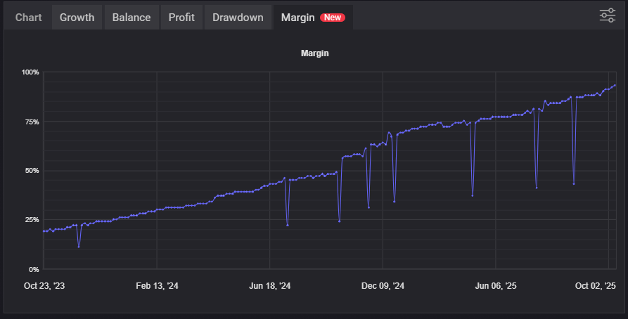
If the line later recovers, it may simply mean the market reverted and the EA escaped. In a non-reverting trend, recovery may not happen, and the risk can end in a margin call.
Why Margin Can Look Like It’s “Trending Up” (Common Misread)
Margin % can drift upward if equity increases while lot size stays fixed. That doesn’t necessarily mean the system became safer.
What matters more is the depth and frequency of downward spikes, not the long-term slope.
Breakout EA Margin Behavior: Fewer Spikes Can Mean Risk Is Cut Earlier
Breakout systems that cut losses tend to show fewer sharp spikes, because they don’t keep accumulating exposure while losing.
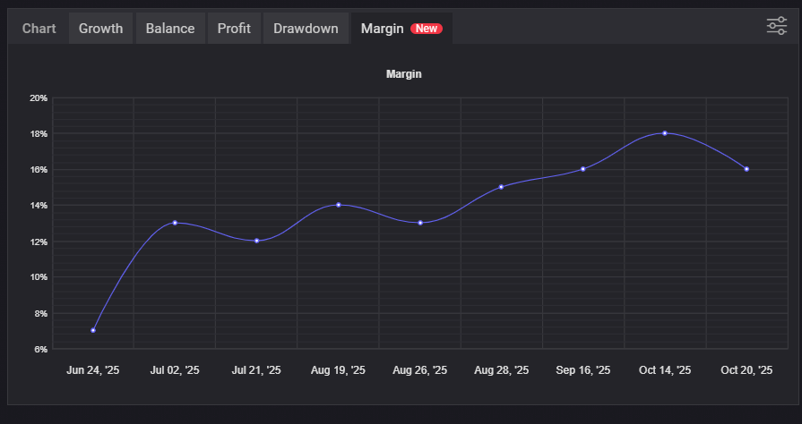
Still, fewer spikes doesn’t guarantee safety—lot size can still be too large, or risk may concentrate in certain conditions. Always cross-check Trades and History.
Margin Tab Checklist
- Are there sharp downward spikes? (how deep and how often)
- Do spikes recover? (did it survive only because the market reverted?)
- Are spikes getting deeper over time? (risk may be escalating)
- Does it match Balance vs Equity gaps? (floating-loss expansion)
- Does History show “adding exposure” behavior? (lot increases, batch closes)
Decision Summary (Margin)
- Many/deep spikes: strong suspicion of averaging-down / expanding exposure (grid/martingale risk)
- Few spikes: may be cutting losses (still verify lot size and history)
- Bottom line: judge Margin by how free margin shrinks during adverse moves, not by “growth” visuals
How to Read Advanced Statistics (Trades): Focus on the Profit Structure and “Fatal Losses”
The Advanced Statistics > Trades tab is the most important page for understanding an EA’s profit structure. Even if the Growth curve looks great, this tab can reveal risky designs like small wins with occasional large losses.
Trades Is Not About “How Often It Wins”—It’s About How It Breaks
Win rate and Profit Factor alone won’t tell you much. Use Trades to check Average Win/Loss and Worst loss to see where the real damage can happen.
| Metric | What it Means | What to Watch |
|---|---|---|
| Trades | Sample size. More trades usually means more reliable patterns. | Small samples are easily driven by luck. Treat short-term results as unproven. |
| Average Win / Average Loss | Average profit/loss per trade—the core structure. | If Average Loss is much larger than Average Win, it often leads to a “small wins, big loss” profile. |
| Expectancy | Average P/L per trade (pips / $).E = Win% × Avg Win − Loss% × Avg Loss |
Even if positive, if it’s too small, costs (spread/commission/slippage) can wipe it out. Related:FX Trading Expectancy (EV) Explained: EAs, Win Rate, Risk-Reward & Money Management |
| Profit Factor | Total profit ÷ total loss. | High PF doesn’t always mean safe. It can look great right up until the collapse. Never use PF alone. Related:Profit Factor (PF) Explained: Why a High PF Doesn’t Mean a Safe Forex EA |
| Best / Worst | The largest win/loss trade. | If Worst is extreme, it can signal “many small wins, occasional fatal loss.” Compare Worst to Avg Win. |
| Sharpe Ratio | Return efficiency relative to volatility. | Low Sharpe can mean the system grows through “endurance” rather than efficient edge. Check with DD/Worst. |
| Z-Score (Probability) | Shows streak bias (how clustered wins/losses are). | A big value can mean “pattern bias,” not stability. Strategies tied to one regime can break when conditions change. |
| Avg. Trade Length | Average holding time. | Very short can mean execution/cost sensitivity (scalping repeatability risk). Very long can mean floating-loss holding. |
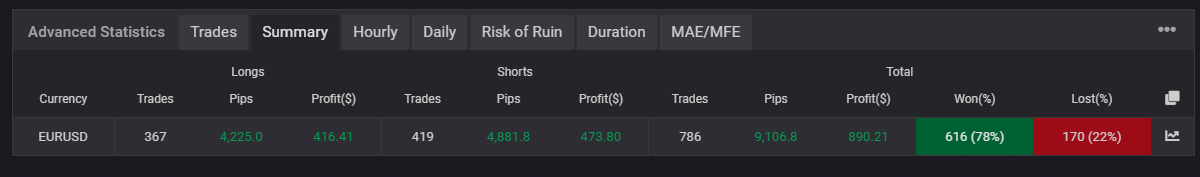
Case Study: How to Read Trades for a Grid EA (CrunchFX)
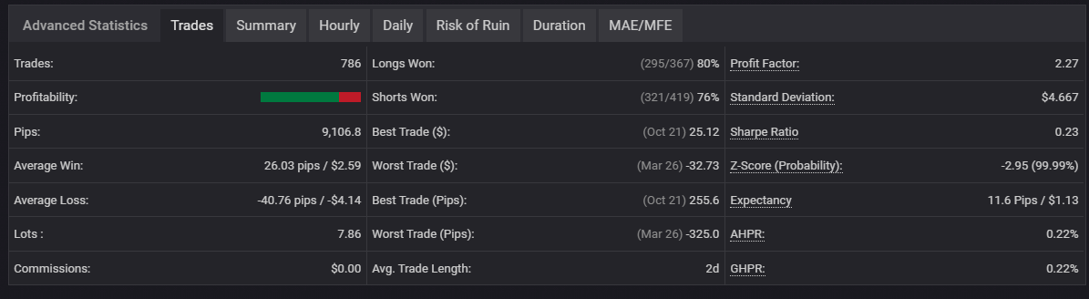
Grid systems often stack many small wins, but can fail hard when price trends one way. In Trades, watch for these patterns:
- Trades 786: a high count is not necessarily safety (grid systems create many trades).
- PF 2.27: high PF can look good until a breaking event arrives.
- Expectancy 11.6 pips / $1.13: edge per trade is small and can be eaten by costs/slippage.
- Average Win 26.03 pips vs Average Loss -40.76 pips: losses are heavier—a classic warning sign.
- Worst -325 pips / Best +255 pips: Worst is larger than Best.
- Sharpe 0.23: low efficiency.
- Avg. Trade Length 2d: long holds can suggest floating-loss holding; verify with Duration/Margin.
Decision Summary (Grid EA Example)
- Looks: win rate/PF look strong
- Structure: heavy losses + large Worst suggests “small wins, big loss” risk
- Next checks: Duration (losses last longer?), Margin spikes, and History (batch closes, no SL)
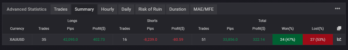
Case Study: How to Read Trades for a Breakout EA (Gold Crab Robot)
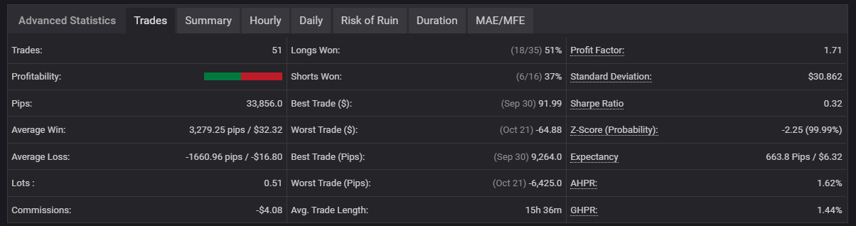
Breakout systems can work even with a modest win rate, because they aim to win big when they’re right.
- Trades 51: still a small sample—avoid overconfidence.
- PF 1.71: not extreme, but could indicate an edge depending on DD.
- Expectancy 663.8 pips / $6.32: larger average payoff per trade.
- Average Win 3,279.25 pips vs Average Loss -1,660.96 pips: Avg Win is roughly 2× Avg Loss.
- Worst -6,425 pips / Best +9,264 pips: Best exceeds Worst, consistent with “cut losses, let winners run.”
- Avg. Trade Length 15h36m: shorter average holds; may differ from floating-loss holding systems.
Decision Summary (Breakout EA Example)
- Looks: win rate doesn’t need to be high
- Structure: Avg Win > Avg Loss + strong expectancy suggests a healthier payoff profile
- Caution: small sample size—wait for more trades/time before trusting it
Trades Checklist (Repeatability and “Fatal Loss” Risk)
- Is the trade count too small? (luck risk)
- Is Avg Loss much larger than Avg Win? (small wins, big loss risk)
- Is expectancy meaningfully positive? (too small gets erased by costs)
- Is Worst unusually large? (potential “one trade kills it” profile)
- Is Avg Trade Length extreme? (too short: execution risk / too long: floating-loss holding)
- Use Sharpe / Z-Score as reference only—don’t conclude from one number
Key point: Trades is where you detect how the strategy breaks. Always read PF, expectancy, Avg Loss, and Worst together.
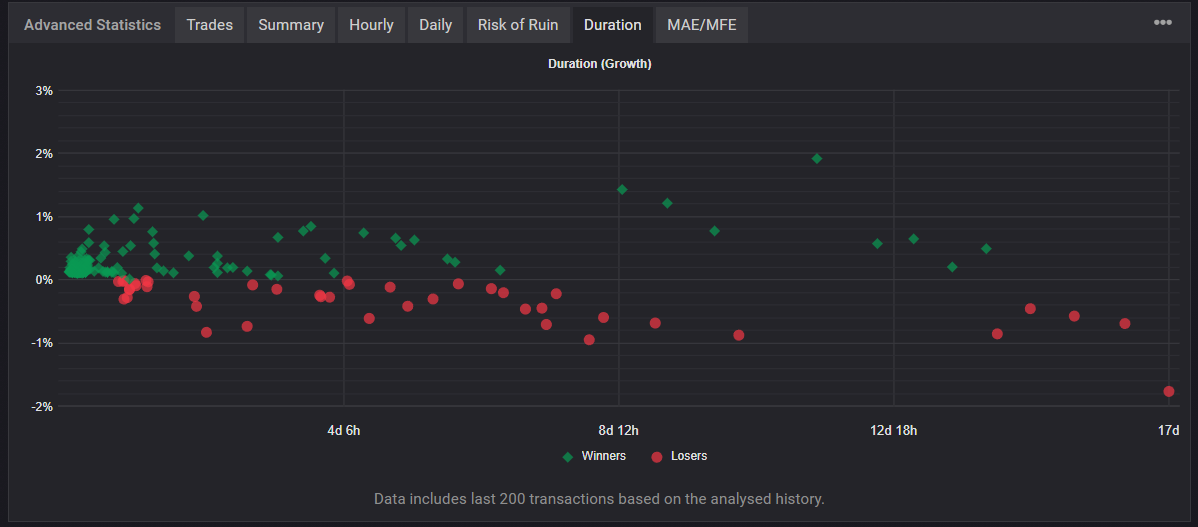
Duration: Is It Holding Losses, or Letting Winners Run?
Duration shows a scatter plot of holding time vs return per trade. It helps you see whether profits come from letting winners run, or from holding drawdowns until they recover.
- X-axis: holding time / Y-axis: growth per trade (green = win, red = loss)
- How to read it: does “long hold” tend to mean profit or loss?
Common Grid Pattern: Losses Last Longer (Red Clusters on the Right)
Grid systems often show bigger losses on longer holds because they tolerate drawdowns.
Common Breakout Pattern: Winners Extend Into Longer Holds (Green Spread to the Right)
Breakout systems may show winners extending into medium/long holds.
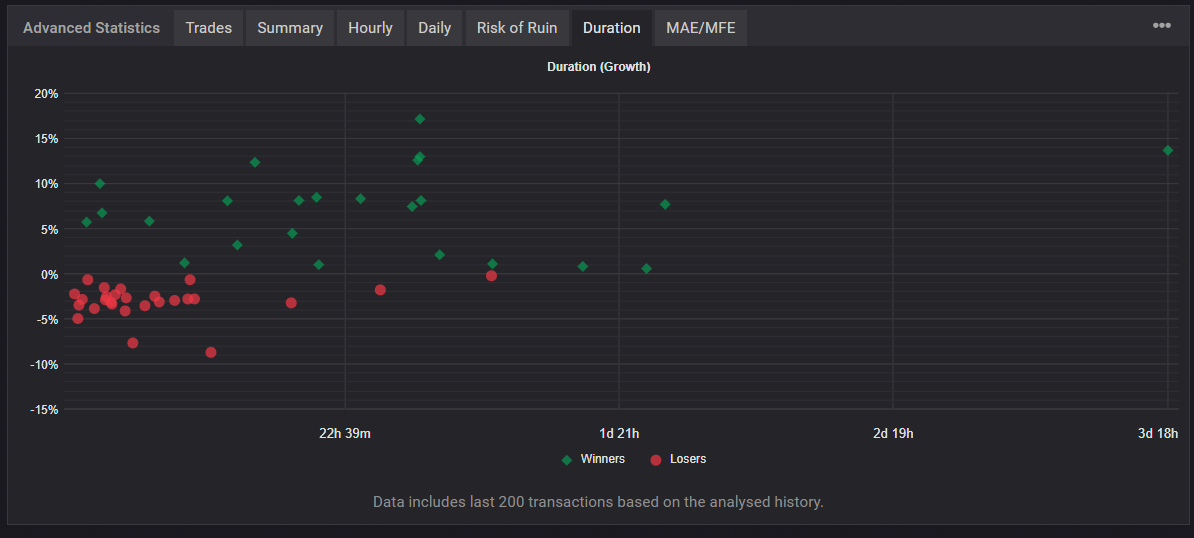
Duration Checklist (Connect It with Trades/Margin)
- Do losses cluster on the long-hold side? (floating-loss holding risk)
- Where do winners appear? (small quick wins only, or winners that run?)
- Does it match Avg. Trade Length in Trades?
- Does it align with Margin spikes? (long holds + spikes = higher danger)
Decision Summary (Duration)
- Red increases on the right: strong suspicion of floating-loss holding (grid/martingale risk)
- Green extends on the right: may be a “let winners run” design (still verify sample size)
History: Where the Strategy’s “True Face” Shows Up
Always check History. Curves and headline stats can hide risk, but the trade list often shows the real behavior.
What to Check in History
- P/L sequence: many small wins with occasional big losses suggests “small wins, big loss.”
- SL/TP: many “–” entries can be a red flag (no fixed stop / manual exits / holding risk).
- Duration: if losses last longer than wins, suspect floating-loss holding.
- Lot size: step-like increases can signal martingale behavior.
- Close time: many trades closing at the same timestamp suggests batch closing (common in grid).
- Mini chart: lots of V-shapes (drawdown then recovery) often indicates “hold until it comes back.”
Grid Example: Many Small Wins + Batch Closing + No SL
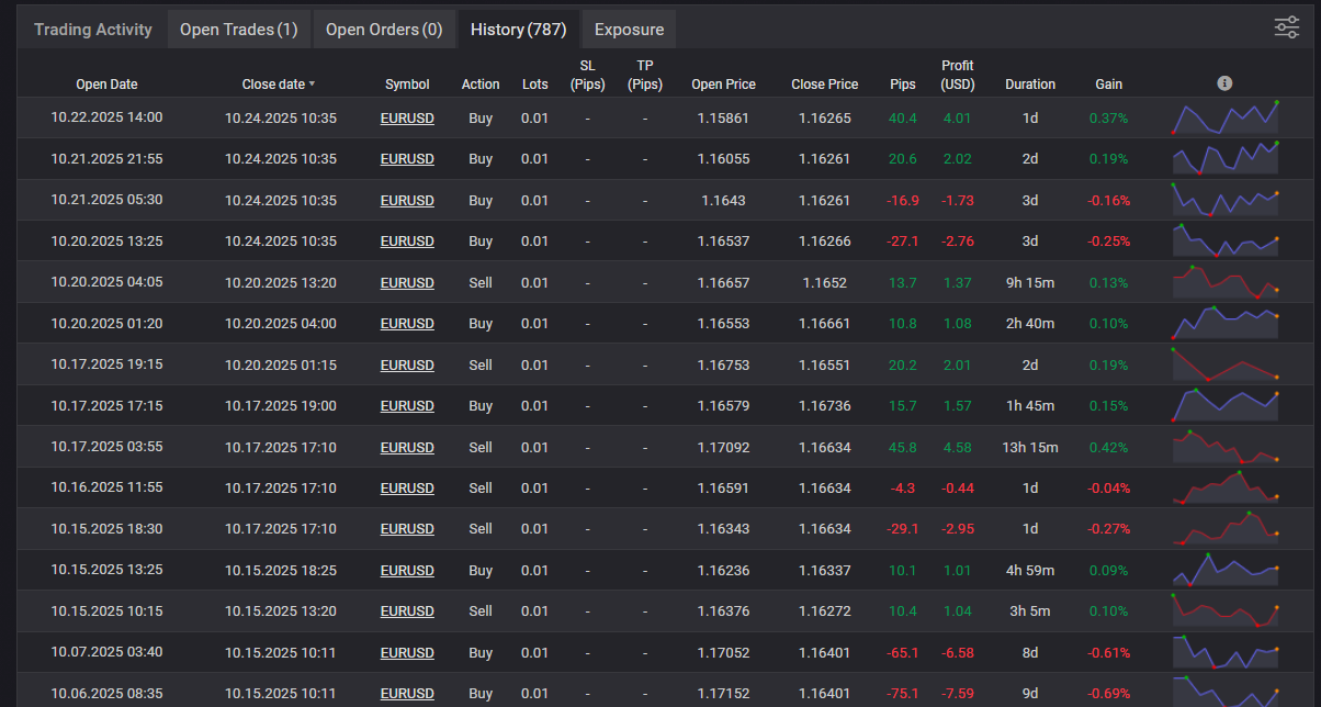
Grid systems can look like “wins everywhere” in a range market, but the losing trades often reveal long holds and recovery exits.
Breakout Example: SL Evidence and Winners That Run
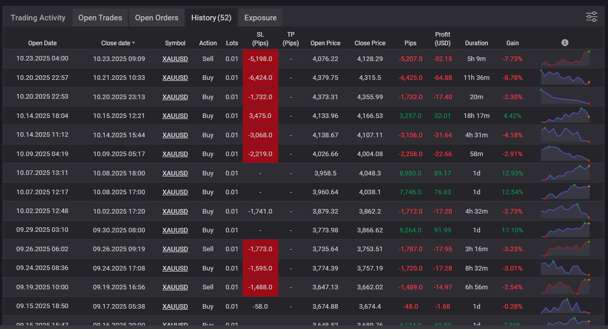
History Checklist (Confirm the Risk Signals)
- Are SL/TP fields mostly “–”?
- Do you see many small wins with occasional big losses?
- Do losing trades last longer than winners?
- Does lot size increase in steps? (martingale clue)
- Do many trades close at the same time? (grid/batch close clue)
- Are the mini charts mostly V-shapes? (recovery-based exits)
Decision Summary (History)
- No SL + batch closes + V-shapes: strong suspicion of grid/averaging-down risk
- SL present + winners run: more consistent with a cut-loss design (still verify sample size)
Trade Map: See Where It Adds and Where It Escapes
Trade Map plots trades on a chart, making it easier to see entry/exit patterns. Use it with History for higher confidence.
Grid Pattern: Back-and-Forth + Stacking + Batch Close
- Buys and sells alternate, or positions stack against the move
- Often no clear stop-out; many trades close together
Breakout Pattern: Fewer Trades, Direction Aligned
- Fewer positions, wider spacing between entries
- Directional alignment is clearer than in grid systems
Decision Summary (Trade Map)
- Back-and-forth stacking + batch close: grid/averaging-down suspicion
- Fewer trades + direction aligned: breakout/trend-following suspicion
Summary by Symbol: What It Trades and How It Trades It
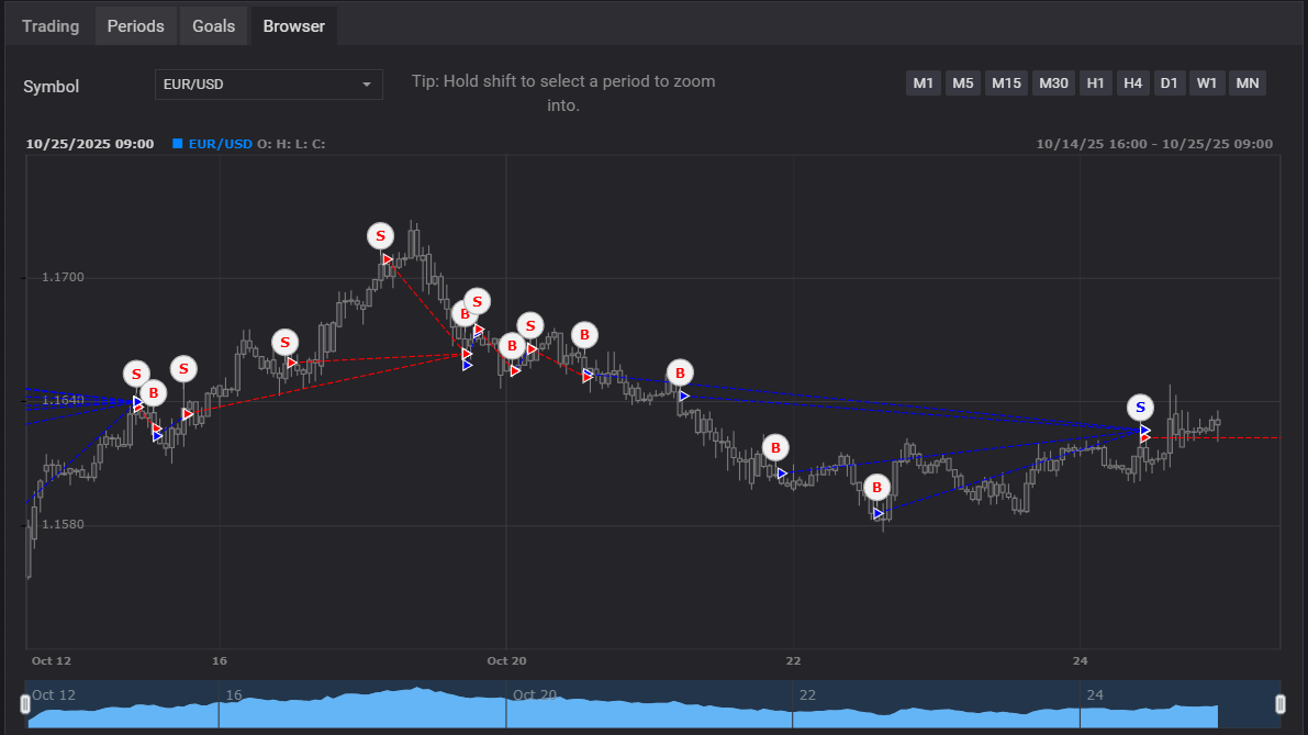
Example: Grid on EURUSD Often Shows High Trade Count and High Win Rate
- Very high trade count is common for grid systems.
- Long/Short looks balanced because it trades both directions repeatedly.
- High win rate can be misleading—always confirm Avg Loss and Worst in Trades/History.
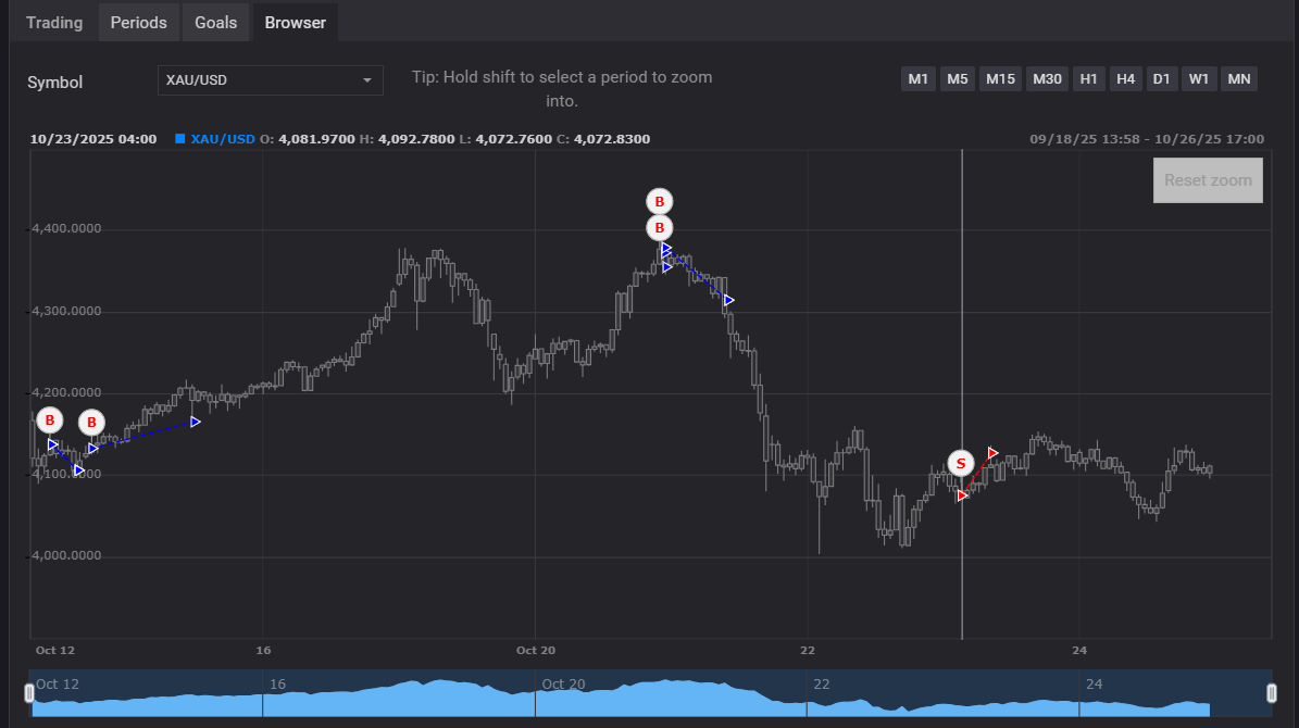
Example: Breakout on XAUUSD Can Have Fewer Trades and One-Sided Strength
- Low trade count means statistics can swing easily—be cautious.
- One side (long/short) may dominate depending on symbol behavior and market regime.
- Even with a lower win rate, it can work if Avg Win > Avg Loss and expectancy is solid.
Decision Summary (Summary)
- Extremely high trade count: rotation-style (grid/scalping) suspicion → check cost sensitivity and floating-loss risk
- Balanced long/short with back-and-forth behavior: range-style suspicion → confirm stacking in Trade Map
- Very low trade count: higher noise → wait for more time/trades
Risk of Ruin: Useful, but Don’t Treat It as a Safety Verdict
Risk of Ruin estimates the probability of losing the account, but it doesn’t always reflect real-world blow-up risk. Strategies that carry floating losses and multiple positions can be underestimated by simple statistics.
Example: Grid EAs Can Look “Safe” on Paper While Still Carrying Hidden Risk
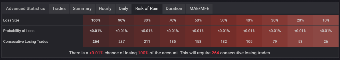
- Grid EAs can show values like
<0.01%, but this may reflect an idealized calculation. - Because grid systems hold multiple positions at once, losses don’t always appear as simple “losing streaks.”
- Use this metric only alongside max drawdown, Margin spikes, and History behavior.
Example: Breakout EAs Often Reflect Stop-Loss Behavior More Clearly
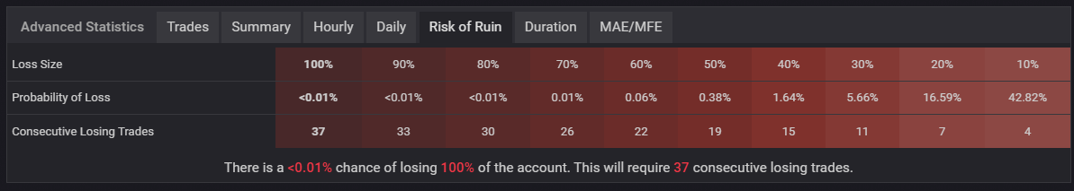
- Even with a low number, real risks like volatility spikes, slippage, and VPS/network issues are not included.
- Symbols like Gold can change behavior over time, which can increase risk.
Decision Summary (Risk of Ruin)
- A good-looking number is not a safety guarantee. (especially for grid/martingale)
- Use it as a helper: combine it with max DD, Margin, and History behavior
Final: A Cross-Tab Workflow to Avoid Being Fooled on Myfxbook
Myfxbook isn’t for admiring curves—it’s a tool to spot risk and repeatability. Use this order to filter dangerous EAs quickly.
Recommended Check Order
- Stats: Track record / Trading privileges / Real vs Demo
- Growth: Balance vs Equity gap
- Drawdown (%): is it acceptable, and does it match the “look”?
- Margin: frequent/deep spikes = strong floating-loss risk
- Trades: Avg Win/Loss, expectancy, Worst
- Duration: do losses last longer than winners?
- History: no SL, lot stepping, batch closes, V-shape exits
- Trade Map: confirm stacking vs clean directional entries
- Summary: symbol behavior and trade frequency (don’t overtrust it)
- Risk of Ruin: reference only—don’t use as the final verdict
If These Signs Stack Up, Don’t Chase It
- Demo + a curve that looks too perfect
- A large Balance vs Equity gap
- Frequent/deep Margin spikes
- Heavy Average Loss + extreme Worst
- No SL + batch closes + lot increases in History
Note: A Pretty Curve Still Isn’t “Safe”
Myfxbook charts can miss drawdowns depending on sampling timing. Always verify with Drawdown (%), Margin, and History, and confirm whether the strategy cuts losses or simply holds and hopes.